In designing the cover for Be Home By Dinner, I came up with eight different variations. As the story spans fifteen years, there were a lot of ideas and metaphoric imagery that seemed to work. After whittling it down to three variations, I decided to present the options to my social media friends and followers on Facebook, Instagram and Twitter and have them vote on the best one. The results were alarming. Of 115 votes:
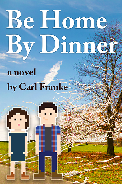
- Pixel Duo = 3 votes
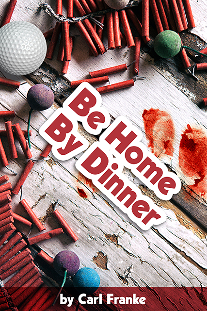
- Fireworks Table = 26 votes
- Cassettes = 86 votes
My favorite was the “Pixel Duo”. This included a pixilated couple standing in front of trees that were covered in toilet paper, a world of mischief at their backs. As hiding within the veil of 8-bit video game graphics is a constant in the book, I felt that this was a strong image to reveal the setting, tone and period. I didn’t even question it until I let people vote. Comments came in that the toilet paper didn’t seem visible and that the pixilated couple was confusing.
“Fireworks Table” was my second favorite, which featured a deteriorating white table with ladyfingers, smoke bombs, a golf ball and hints of fingerprinted blood. Although these items were important elements of the book, it seemed too busy and didn’t translate well when at a small “thumbnail” size, which is how most initially view book covers in the online world.
“Cassettes” featured an upright cassette with a stack of multicolored ones behind it, all with a hideous yellow and white felt textured wall as a background. The cheery nostalgia of the image made me equally cringe and grin. It seemed filthy, as if I could smell the second hand smoke emanating from the floral fabric.
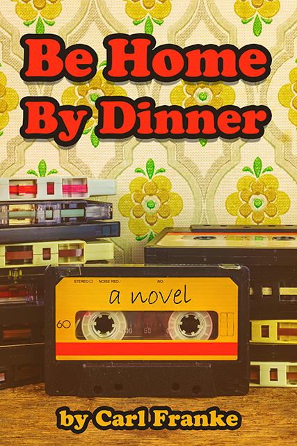
With “Cassettes” winning in a landslide, I thought more about the role of this hissing and easily deteriorating medium in the story. The device itself plays a critical role as a form of evidence and is a constant as music self-discovery unfolds. A mental “mix tape” occurs as well, which uplifts the protagonist to an ending he couldn’t fathom occurring. “Cassettes” was also was the easiest to read and identify at a smaller image scale.
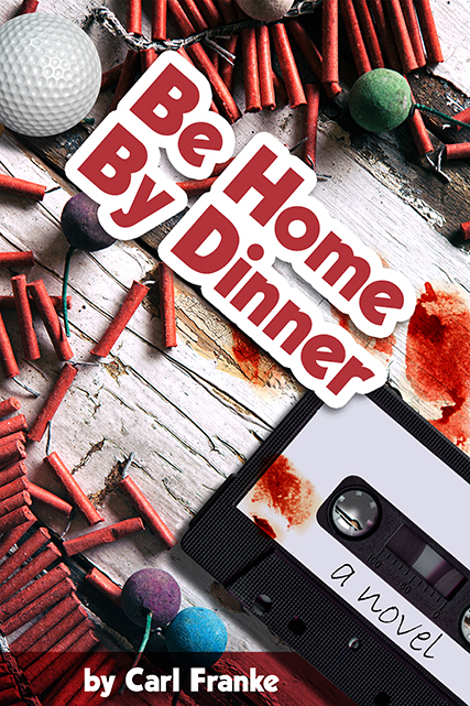
Above, I dabbled with adding a cassette image to the “Fireworks Table”, but it appeared even more crowded.
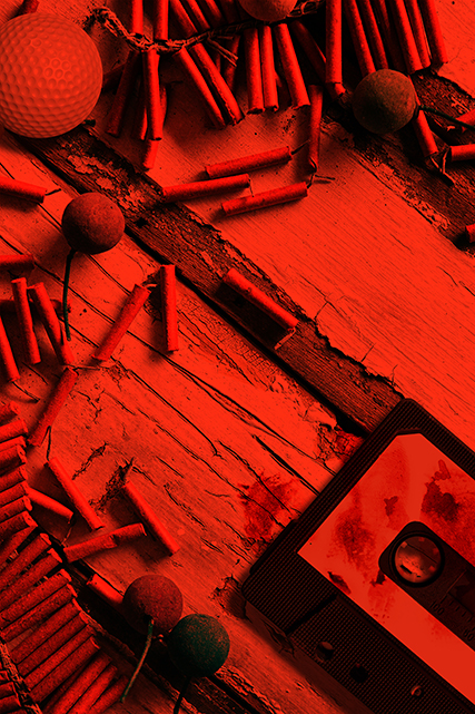
But the updated “Fireworks Table 2” image became an ideal back cover image, with the spine’s orange literally bleeding over it with a Photoshop Overlay layer effect. The gleeful colors of the front cover image came to an abrupt end on the back, where the table of objects appeared to be devices in a photography dark room. The antagonist’s “instaphotos” seem to linger nearby, something the reader eventually learns about.
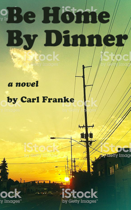
In a panic, I went to the drawing board and tried to find the perfect sunset image, an evergreen signal of the mandated curfews that the kids of Oreland obeyed. I felt certain, momentarily, that this was the way to go.
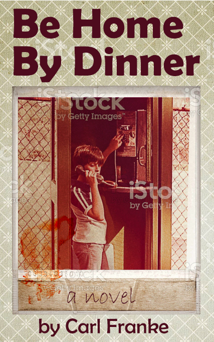
I then considered an image of a boy at a payphone, which happens several times in the book with the protagonist. The image appeared too dreadful and not reflective of the entirety of the period covered in the story. It was too late 70s. I was just in love with the image. If I had unique imagery for each chapter title, this would have been perfect to use.
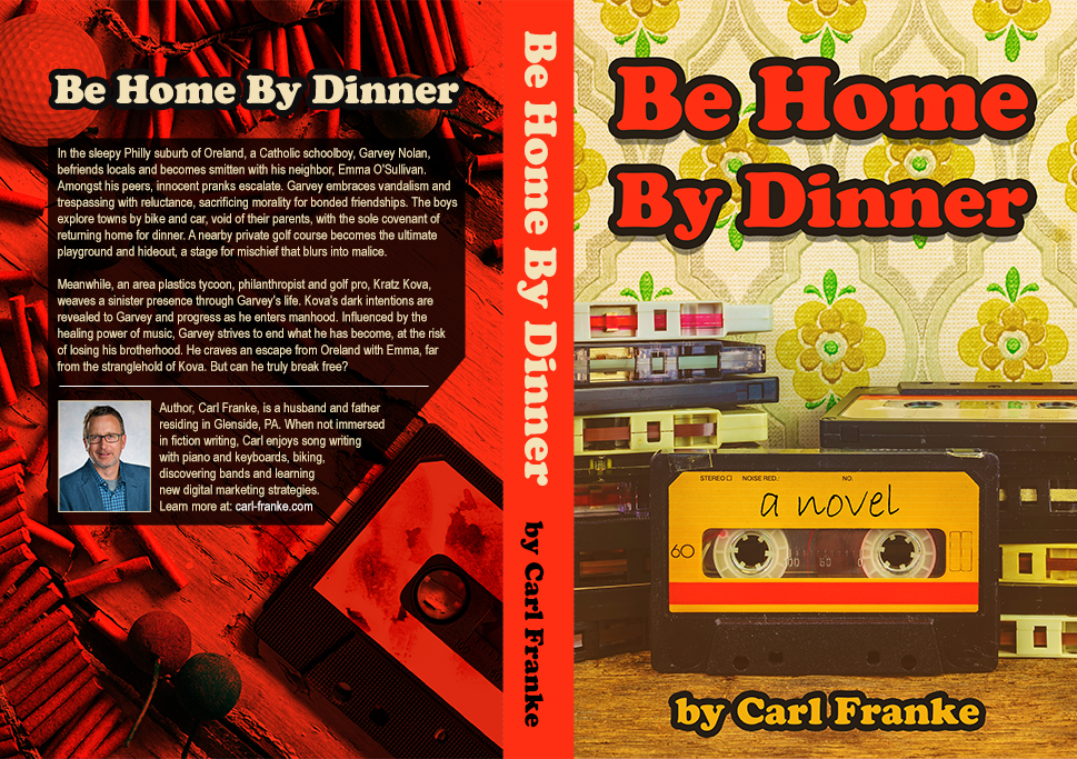
Finally, I happily settled on the above. The orange streak on the cassette, the color of warning, became the color of the spine and bled onto the back cover reveal of some devices of mischief.
Which one would did you like the best?
It’s perfect! 😁